Not every organisation has a large photo library with high-quality, relevant and bespoke photography and even if they do, there is often a need to turn to a stock library to fulfill content that the in-house library cannot. That doesn't mean you have to end up using ‘too perfect’ people in unrealistic situations.
Viewing entries in
Annual reports
Why is the content supply and its format so important to delivering a successful and painless annual report? What can a client do to make sure the data and content is faithfully reproduced in the final publication?
Supplying content in a way that minimises misunderstandings, styling errors and omissions is extremely important to preserve the integrity of the report.
Here we go through the absolute ‘dos’ and ‘don’ts’.
This may sound a little demanding from a supplier, but the message here is this, what do we need from you to make the delivery of your annual report as smooth as possible, taking away any frustration (on the client side) and making what is a difficult project a bit easier.
Establishing a theme for an annual report delivers a far more engaging solution for stakeholders. Discovering what that theme for the year might be is part of the process we take before we begin the creative process.
During a creative round in the studio today, an interesting question came up. We had already established with the client the year’s messaging and developed themes and potential titles for the report.
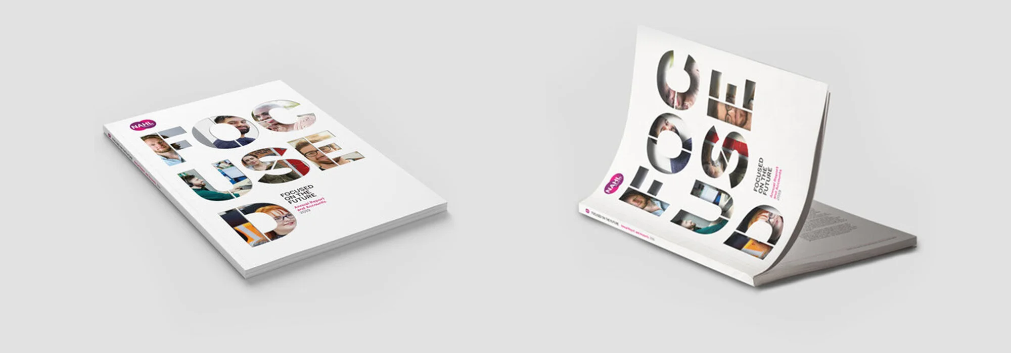
The question was ‘Should the imagery/content for the cover of the report illustrate what the organisation does, who the client’s customers are or focus on what the stakeholder and investors want to see?’.
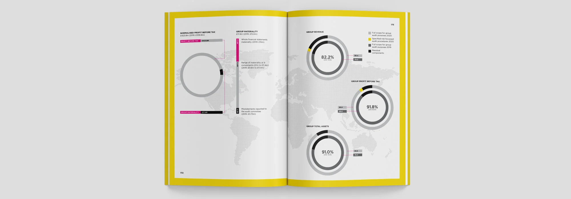
The highlights section in an annual report is arguably the highlight of the entire document itself. They can make great infographics that can be drawn out of the report and be used in presentations to give a snapshot of the year’s successes.
The days of printing thousands of copies of a printed annual report seem to be over. And that’s a good thing. So whilst we are all going digital with our annual reports, we need to rethink what formats we deliver them in and what that means for the readership.
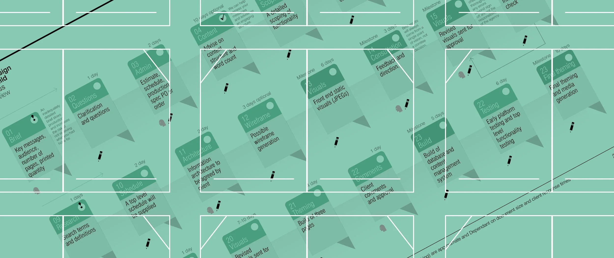
To design and build an annual report micro site or one page website, you should be aware of the steps and potential issues you may come across. In this article, I will walk you through the process.
Content should be edited down to the bare minimum, bearing in mind users are unlikely to read large sections of text. The less text, the better. We will link a PDF of the full report for users to download so that they can view the full report should they wish to.
CSR (Corporate Social Responsibility) and ESG (Environment, Social and Governance) reporting, by its very nature, offer up different types of reporting to stakeholders. They both have a slightly different agenda and are becoming more and more important and sought after by potential stakeholders and potential investors.
When designing and delivering ESG (Environment, Social and Governance), Annual Reports, White Papers or Strategy documents, there are alternative formats that may suit your audience better than the traditional A4 PDF. Here we discuss the merits of some of these different approaches.
As we have discussed in our previous articles: What is an ESG report and Maximising your ESG report impact, we focus on a particular sector – banks and investment companies to detail some of the specific requirements that these sectors may need to deal with.
We have discussed what an ESG (Environmental, Social and Governance) report is and the potential structure one might take as part of your corporate reporting as part of our annual report design service, Navig8 can help you bring to life, your ESG goals and strategy.
Environmental, Social and Governance (ESG) reports are becoming increasingly important as stakeholders and investors are demanding more and more, to see a company's impact on climate change and the environment, social ‘responsibility’ and good governance.
An annual report can and should be so much more than just an illustration of the past year's financial statements and compliance. Every member of the delivery team will have a different agenda and communications goals.
Every business has a human element and a story to tell. even if you sell robots, software, or rubber flanges. Human stories are what people want to read about, they can bring any report alive and add a different dimension to an annual report.
Starting from a basic print production on a low print run, here is a selection of dinging techniques, from the cheapest to the most expensive. Prices are marked using the restaurant listing method you often see, starting in ‘£’ – ‘£££££’. Prices will vary enormously, so seek advice from your graphic design agency.
An interactive online Annual Report can mean different things to different people. There are a number of solutions available to clients, each with increasing complexity and cost. But they don’t have to cost a fortune.
If you have read the article Adding Impact to Your Annual Report: Print and Binding, you will know I have saved the ££££ cost options for adding something special to the print production of your annual report.
Annual report for a global Plc is only part of the communications package for an organisation's stakeholders. As part of our service we were tasked with producing the full range of stakeholder coms.


