This is what I told the work experience student: ‘It’s a document companies produce every year to report back to their stakeholders on the activities and finances over the last year.’
We had a school student doing work experience at Navig8 who asked a simple question, ‘What is an Annual Report actually for?’. A simple enough question, you might think, but it turned out the answer was surprisingly complex and long.
These are not the terms you hear when discussing the delivery of annual reports and accounts. But behind the delivery schedule, the delivery team will employ many of the delivery techniques a web development team uses, notably sprints and an agile approach.
BIDs operate within a defined area to enhance the district beyond what the local authority can offer.
What makes them different, to my mind, is that they are paid for by the businesses to work for the businesses, solely where they operate.
True story; an esteemed client came to us the other day with a sustainability report one of their consultants had written and presented to them. Let’s just say the client's feedback to the consultant wasn’t positive. I won’t quote the feedback as this is a family blog.
I introduce myself because this is a personal, as well as a professional comment on what my input on a typical annual report project entails – with all the good and bad bits.
My job has a number of factors in the annual report process. I’ll leave out the day-to-day business activities involved in keeping a 24-year-old design and marketing agency going.
Any design agency worth its salt will bang on about the importance of being consistent on how a brand or corporate identity is applied.
It is important. Here’s why.
Launching a new company is an exciting time for everyone involved. It’s tempting to try and save money and do a bit of DIY branding – we understand that – so here are five steps you should consider to get your new brand in the best possible place.
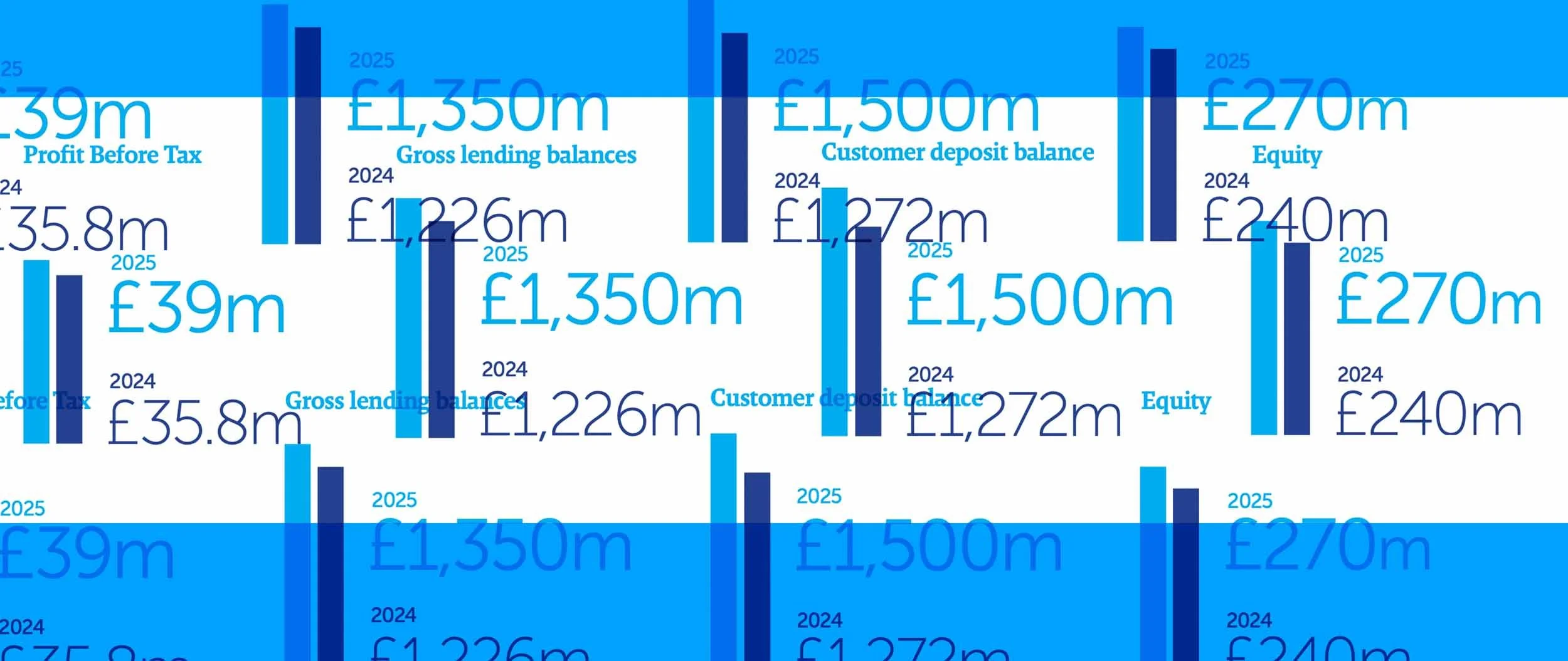
Highlight pages in annual reports have become very popular and for good reason. They give a visually engaging overview and translate well into social media and PowerPoint presentations.
When we work with a new client, they have deep concerns about getting early proofs with draft content ready, to show progress to the board or management team during the early stages of the annual report delivery process.
Photography plays a huge part in almost every annual report that Navig8 produces. Here we discuss how best to utilise photography, avoid cliches and make the most of what you might have to work with.
As part of our stage one briefing process, we will ask if there is any particular theme or messaging that encapsulates the year. This article explains why we ask and what it means for the report’s design.
I realise this might sound like a really stupid question – but it isn’t. The question is deceptively simple, after all, we provide graphic design services, right? Right, but you may think that designing logos, brochures, annual reports – all that stuff – is all we do. But we do so much more.
With every annual report we design we devise a bespoke grid. A grid is the invisible framework that holds all the content together. It helps deliver consistency, increase legibility and improve the visual impact of the document.
Everything starts with a kick-off meeting and they can be a really useful way to define and agree on a whole host of project-related issues. The client will have their own agenda and a list of things they would like to cover, and the design agency theirs. In this article, we set out a list of questions from a design agency's perspective that will go a long way to ensuring a happy and successful annual report delivery.
There are many specialist designers, from packaging and branding to annual reports. While most designers are 'Jack of all trades' it takes particular skills to be a master of annual report design.
In this article, we detail the skills you need to 'cut the mustard'.
The cost of producing an annual report can vary wildly. We have delivered them for as little as £2k to as much as £40k. So where does your money go and what should you budget for when commissioning an annual report?
There are annual reports and then there are annual reports. What sets the good aside from the outstanding – in terms of design – are the details. In this article, we give away our secrets as to why our annual report designs look ‘tighter’, cleaner, more legible and generally have higher design values.
When you design a PowerPoint presentation, you want to get and keep that attention. Your aim should be to leverage the world's most lucrative currency to meet your objective. A well-designed PowerPoint has the power to captivate an audience by simplifying complex subjects and creating visual aids for composite data. It can persuade and engage, validating your topic.
Setting (or typesetting) a clear set of financial statements in annual reports and accounts is an art in itself. They should combine standard accounting practices and enhanced design and typography to bring a higher level of clarity and enhance the brand.


