Designing Charts and infographics
Do your numbers stack up?
Infographics are a brilliant way to quickly communicate a journey, a process, a service, all sorts of things. They are far more visually engaging than a paragraph of text and done right, can deliver complex messages quickly and with style. We do a lot of them and there are certain things that help make them work hard for you.
In this newsletter we offer up a few tips and best practice advice when you are thinking about an infographic or two.
All the pies you can eat
Pie charts add a bit of life to an infographic. Using multi-layering, stacking circles on top of each other and using transparent segments really put the data on the menu and get the users salivating. Like most things in life, less is more, a pie with too many slices becomes hard to digest. Keep your data segments below 10 so that it does not become too overwhelming and a feast on the eyes.
All bar one
Bar charts are the data analyst's friend, they come in all sorts of shapes and sizes. Bar charts are better suited to deal with big discrepancies in figures than pie charts are. If your data swings from two to 52, a bar chart will give the reader a better comparative view. Try to think out of the box (or bar) – it's much more engaging to see a stack of magazines or a line of lego bricks than the boring old bar.
Creating something iconic
We all love icons don't we? Icons that were originally designed for the ladies and gents toilets are now being chucked onto pages to communicate something else. It just doesn't send out the right message, does it? The thing about icons is that only a few are recognised on their face value. The search icon... yes, we all know what that looks like. But the same cannot be said for 'intellectual property renewals'. Use with care.
The big numbers
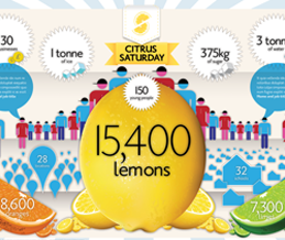
We go through the content with the client and listen to what they feel are the most important messages. A good infographic will include two or three of these. But there is nothing better than a big number to draw in your readership which is then followed up with a more granular level of reporting. Don't forget to let these numbers 'breathe', space is more important than size.
Trump-O-Graphic
Donald Trump's insane outbursts provide excellent material for a infographic, or 'Trump-o-graphic' as we like to call it. We created one from a Brit's point of view.
The very British Trump video
Cockney Geezer Trump video
I have a six page Word file...
This happens a lot. We get a vast amount of text that needs to fit in an A4 PDF. That ain't gonna happen. If if we did cram it in, yeesh, the reader would be overwhelmed. If you are looking for an A4 infographic, half a page of Word content will be about right. Arrange your content in levels, some big stuff and some smaller more detailed text.
Last and by no means least we have written an article all about creating the best infographics.


